I’m going to try to do this blog post in english even if I don’t know the words for these things in english. But please bear with me. It’s a very interesting topic.
I have been studying part time during the spring, and I have learned how to knit, but I have also learned a lot about colours. The class I have taken is called “Knit and crochet with colour” and the school is called Västerbergs folkhögskola.
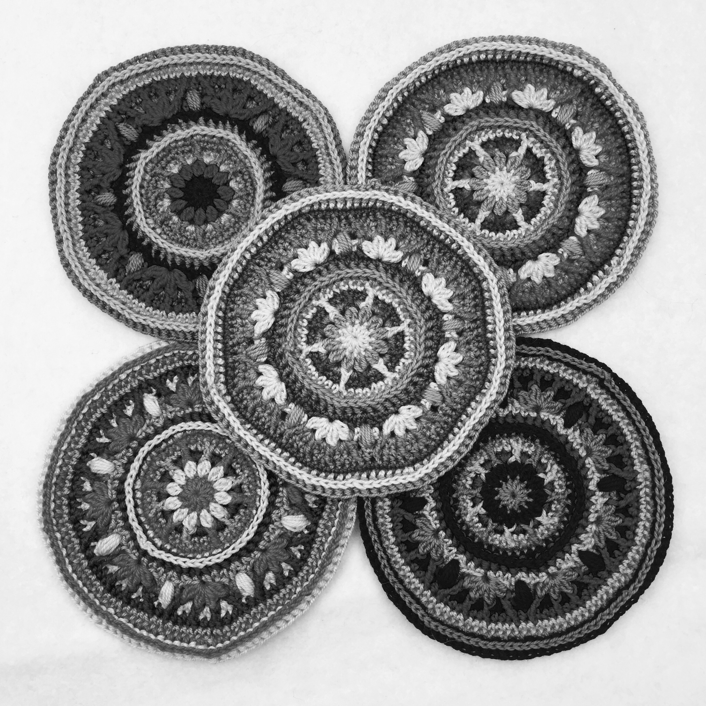
Two of the things we have been learning about is (and this is where I don’t know the correct terms) pattern articulation and transposing. I’m going to try to explain to you what it’s all about and therefore I have crocheted five versions of part 1 of the cal atlanticus.
You find the cal here:
https://hookedonsunshine.co/category/cals/
I have been using the yarn Maxi bonbon by Scheepjes and a 1,5 mm hook.
You can buy the yarn at favoritgarner:
https://favoritgarner.se/produkt/maxi-bon-bon-scheepjes/
I have used 4 colours in all of the mandalas.
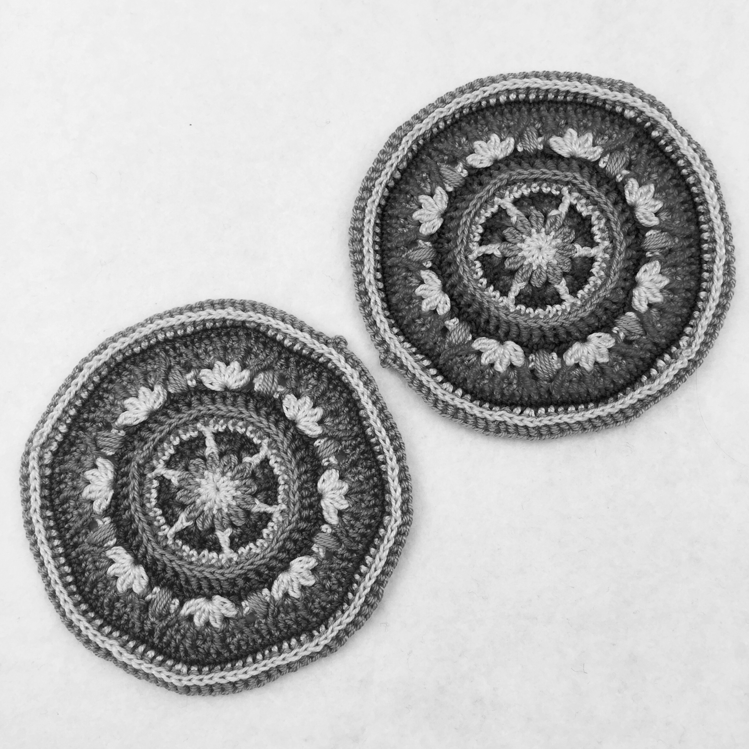
In this picture you can see how I’ve been working with transposing. It means that I have tried to keep the looks of the pattern, in one colour combination, in a different colour combination. If you look at the picture you can see that the center is light on both of the mandalas, there are six light stripes outside of the center flower, there is a dark circle, you can clearly see that the flowers have four petals each etc.
When I picked out the colours, I chose a combination in blue that I took a picture of in black and white. When you take a black and white picture, you will see how the colours look grayscale. I chose a combination where the colours went from light to dark on the scale. After that I searched for four other colours that were places on the grayscale in the same way. I didn’t get a perfect match, but it was close enough. I crocheted only one row at the time with each colour and I went from the lightest colour (again on the grayscale) to the darkest and after the darkest I started over with the lightest.

Here you can see how the pattern looks the same when you take a black and white picture.
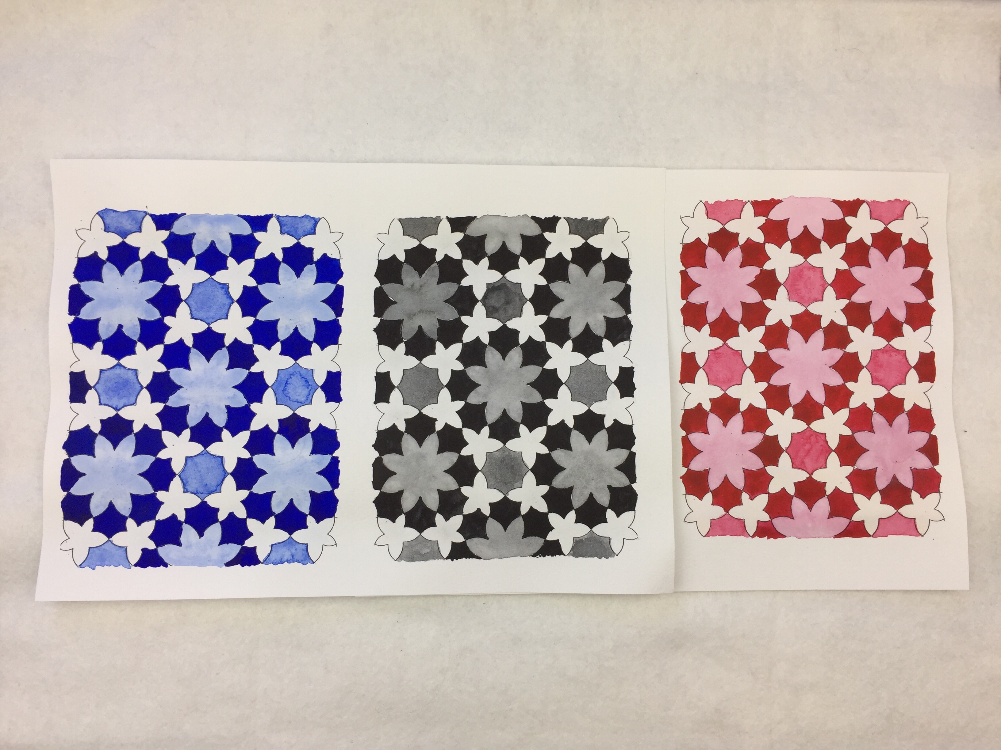
Here I’ve done the same thing by painting. This was one of my school assignments. I started to paint the blue version first, after that I changed into grayscale and in the last step I tried to recreate the same colour pattern in pink.

This is how it looks in grayscale.

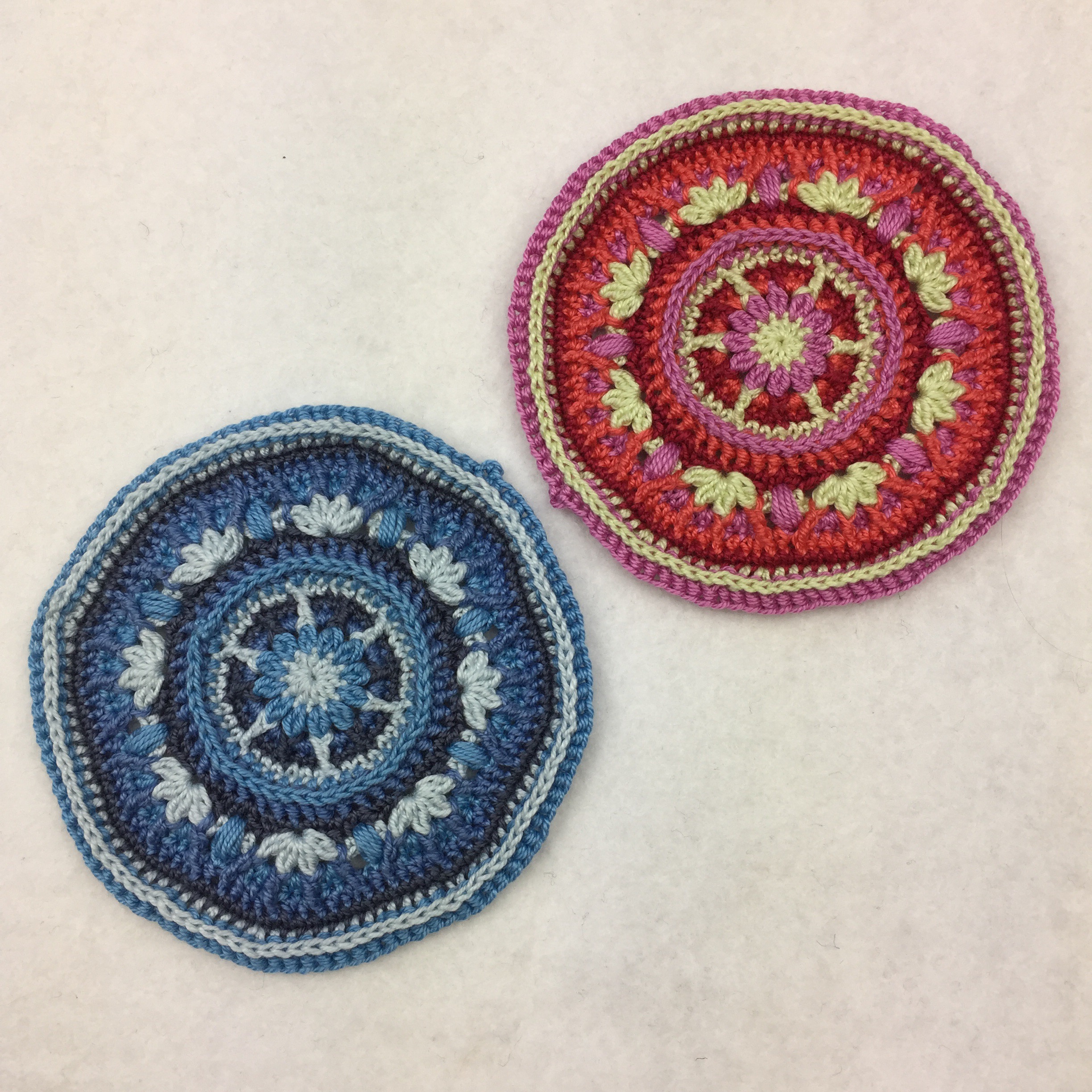
I have crocheted these one colour per row. The blue one is the same as you have seen before. The colour placements goes from the lightest to the darkest on the grayscale. On the bottom right one I have also used colours that are placed from light to dark on the grayscale, but I have placed the colours in a way so they’re not gradient from light to dark. Instead, I have tried to place them so there is as big contrast between the colours that are next to each other. For the last mandala, I didn’t chose colours depending on where they were placed on the grayscale. I just picked four random colours.
So even if I have used four colours in each of them, and I have repeated the placement of the colours over and over again, the pattern of the mandala looks totally different.
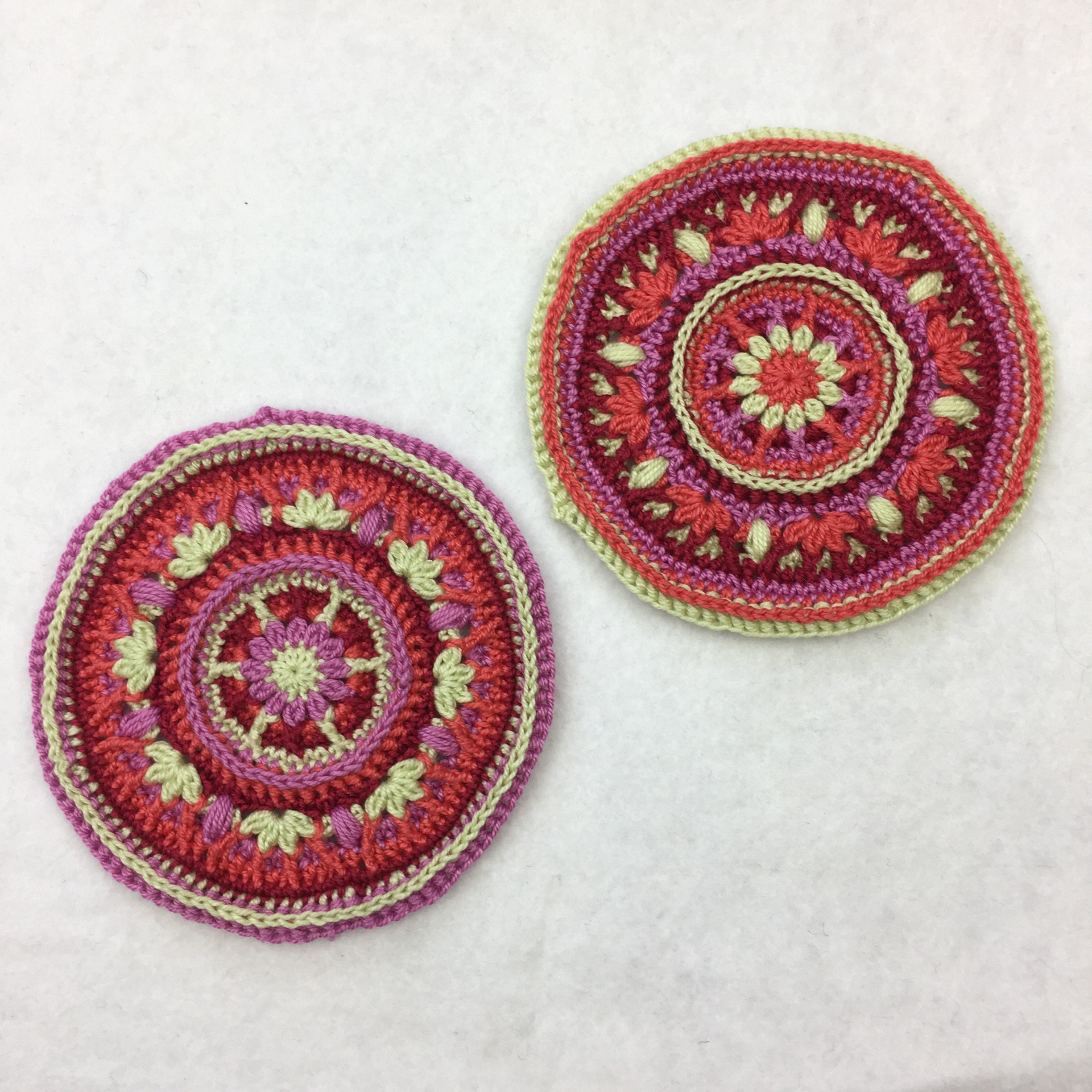
These two are made in the same four colours, but since the order of the colours aren’t the same, the pattern doesn’t look the same. This is what’s called colour articulation. Since the colours aren’t placed in a gradient order, they appear more bright than on the left one.

The mandala to the left is worked in the same way as the other once you have already seen. Four colours that are worked repeatedly one colour per row, and the same order over and over again. The mandala to the right, on the other hand is worked in a different way. I have chosen to place the colours in a way that make the pattern appear in a totally different way. They are not placed in a repeated pattern.You can see that the flower with four petals looks totally different when you work the round with back post stitches, that are placed around the petals, in the same colour as the flowers.
When you start to understand how the colours affect each other, it becomes easier to put together a specific combination that you’re looking for. There are no colour combinations that are wrong and I recommend you to play around with different colours and try placing the colours in different orders.
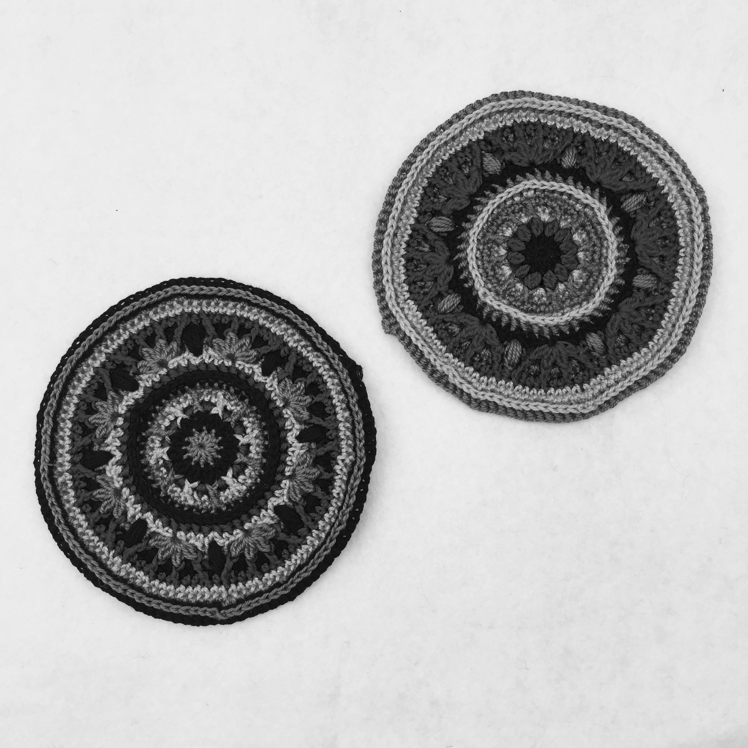
This is how all of the pictures looks in black and white.